
We are in the final proofing phase of my book, Adopting the Father’s Heart. I thought that you might enjoy taking a look inside. You can even give me your advice on the cover design by leaving a comment.
Here is the tagline if you didn’t know I was writing a book:
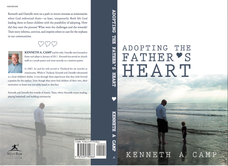
Adopting the Father’s Heart is a vulnerable and challenging look into God’s call to orphan care through one couple’s experience with adoption.
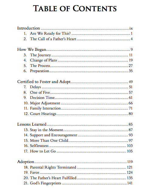
Want to take a look at the table of contents? Sure you do!
You can read the first two chapters here for free:
Chapter 1—Are We Ready for This?
Chapter 2—The Call of the Father’s Heart
I am publishing with Westbow Press, a self-publishing division of Thomas Nelson. You can read more about my decision to self-publish with Westbow here: Author as Entrepreneur.
If you want to receive updates on the progress of the book and when it is released, Like our Facebook Fan Page. You can do that by looking to your right on the sidebar.
Have any advice on the cover design? Please share it here in the comments section.
Love the title! It’s so true! As God has brought us through our miscarriage and a lot of heartache, we began seeking His will in our plans to have children. Soon realized God was calling us to adoption. We believe that adoption is not our last option to have children, and certainly not second best. What a wonderful thing God created. After all, He first adopted us as His children. Can’t wait to read your book!
Thank you Kathryn. I agree that adoption is not a last option nor second best. I know that I am thankful He adopted me!
I like the cover layout a lot! My one thought would be: Is there are reason that the words are so low, over the ocean slightly, rather than filling the white space above? Other than that, very nice.
Jagi, I have the same thought about the white space above. It seems too much of a stark transition. Moving the wording might do the trick.
I like the front cover. I’m wondering about the back cover. You have plenty of room for a couple of author blurbs/referrals if you move your author information down.
Tom, great to hear from you. Good advice about the back. I will apply that.
I like the cover just fine. It is very subtle, calming even. I grew up around the ocean and can feel what the image is saying. I also read the two chapters (I think the first one didn’t download all the way tough. Curious to know how the story ended) – Thanks for sharing!!
Thank you Gabriela. I will check out the downloading of the first chapter.
I can’t see anything I don’t like about it. The cover is nice, have you toyed with a black and white image to see how it looks? What about black and white with the kid in color? Or the father?
Leo, I will play around with some black and white imaging. Thanks!
How can I pre-order? I think this will be an awesome book Kenneth. As for the design, I agree with Jagi.
Thank you Jayson. I am working on the pre-order option. If I get it going, I will post something about it.
I am so drawn to this cover Kenneth. I have been thinking about Westbow Press as well. I’ll read your take on it, for sure. Good Luck!
Linda, thank you for taking a look at the cover design. I have made some changes to it. I will post the updates soon. I will also post my thoughts about publishing with Westbow. Overall, it has been positive.